InMyHeart Posted June 15, 2014 Report Share Posted June 15, 2014 No thread on it, for me, its a raging success. I'm in-love with it, reckon its got this class about it that is above and beyond the rest in the league, would love everyone's thoughts and to discuss it Quote Link to comment Share on other sites More sharing options...
Dr.Dreas Posted June 15, 2014 Report Share Posted June 15, 2014 The more I look at it the more im starting to like it. I was a bit pessimistic at first but after thinking about it. No one in the leauge has anything close to this. The only thing im not sure about is why they have a yellow ring around it. It should be black. However. Overall its pretty tough. I cant wait untill the kits are released. Im really happy though they kept the heart logo on the sides instead of soccerballs. Quote Link to comment Share on other sites More sharing options...
Tonyboozeadams Posted June 15, 2014 Report Share Posted June 15, 2014 I like whales Quote Link to comment Share on other sites More sharing options...
Young Polak Posted June 15, 2014 Report Share Posted June 15, 2014 I'm on the fence with this design. Quote Link to comment Share on other sites More sharing options...
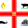
jw1739 Posted June 15, 2014 Report Share Posted June 15, 2014 Love it. Absolute class and way way the best in the League. I believe that the "yellow ring" is actually orange as per the four emblems taken from the flag and coat of arms of Melbourne and represents our link to New York City. Quote Link to comment Share on other sites More sharing options...
Dearg is bán Posted June 15, 2014 Report Share Posted June 15, 2014 I definitely like it, but it does seem strange to have 'MCFC' as well as 'Melbourne City Football Club' on it. The hearts are a great touch, and I love the font used (Gotham). I also think it's great that the Melbourne flag was incorporated into it, and I'd like to think this is a nod to the fans using the flag for the last few years. The 4 redrawn icons work well, and it's clever and quite subtle to use the ship from the Man City crest (even though I'm not a Man City fan. The opposite in fact). I wouldn't have put the crown on it, even though I know it's on the Melbourne flag, but that's more to do with my personal opinion of the monarchy than anything else. Overall it does have a great 'traditional' football crest feel to it. Quote Link to comment Share on other sites More sharing options...
Nate Posted June 15, 2014 Report Share Posted June 15, 2014 Great logo tbh. Quote Link to comment Share on other sites More sharing options...
Tbitm Posted June 15, 2014 Report Share Posted June 15, 2014 I'm a fan, whenever we had threads before the takeover about changing the badge I liked the ones people designed that included our flag in them. It gave them more of a traditional feel. Wouldn't mind an est 2008 on it though. Quote Link to comment Share on other sites More sharing options...
Melburnian Posted June 15, 2014 Report Share Posted June 15, 2014 Easily best logo in the league. Such a football brand rather than an Americanised bunch of crap. Very happy with it. Quote Link to comment Share on other sites More sharing options...
GhostDog Posted June 15, 2014 Report Share Posted June 15, 2014 at first i really liked it, not fond of the blue of course but like the classic look, only thing i really dont like is how similar it looks to the new york team Quote Link to comment Share on other sites More sharing options...
marteaux Posted June 15, 2014 Report Share Posted June 15, 2014 Love it. Just don't like how they changed the ship or put a crown in it. Whale is funny as fuck though. Can't wait to play ACL games in japan with that as our logo. Whale for club mascot anyone? 1 Quote Link to comment Share on other sites More sharing options...
M13 Posted June 15, 2014 Report Share Posted June 15, 2014 Is not the yellow parts supposed to be golden?.. I just assumed so anyway. As for the crown it´s from the Melbourne coat of arms as well. Quote Link to comment Share on other sites More sharing options...
cadete Posted June 15, 2014 Report Share Posted June 15, 2014 As I posted elsewhere it stood out easily as the best logo amongst the other snide crap when the fixtures were being released... 1 Quote Link to comment Share on other sites More sharing options...
InMyHeart Posted June 15, 2014 Author Report Share Posted June 15, 2014 As I posted elsewhere it stood out easily as the best logo amongst the other snide crap when the fixtures were being released... this EXACTLY is how i felt Quote Link to comment Share on other sites More sharing options...
kingofhearts Posted June 15, 2014 Report Share Posted June 15, 2014 Meh Quote Link to comment Share on other sites More sharing options...
RedAndWhitePride Posted June 15, 2014 Report Share Posted June 15, 2014 (edited) Reiterating most other posters, but it's by far the best logo in the league. Couldn't have asked for a better design, really. Edited June 15, 2014 by RedAndWhitePride Quote Link to comment Share on other sites More sharing options...
schrecky Posted June 15, 2014 Report Share Posted June 15, 2014 Know what I like apart from looking professional. The fact it has the red&white in the logo. The logo will now never change which means we keep our red and white forever. Which also means we are no mini man city and have our own unique melbourne identity. That's what I like. 2 Quote Link to comment Share on other sites More sharing options...
thedukeofhearts Posted June 15, 2014 Report Share Posted June 15, 2014 At first I thought it was ok, nothing amazing but not cringe worthy, but the more I see it the more I like it. Quote Link to comment Share on other sites More sharing options...
Dylan Posted June 15, 2014 Report Share Posted June 15, 2014 10/10 would bang Quote Link to comment Share on other sites More sharing options...
InMyHeart Posted June 15, 2014 Author Report Share Posted June 15, 2014 IMHO I think this little write up hear has a lot of mayo on it, It is easy to see through when they are basically manipulating the fans Quote Link to comment Share on other sites More sharing options...
M13 Posted June 15, 2014 Report Share Posted June 15, 2014 Given the number of people in Melbourne that had no idea it was their own coat of arms I´m not surprised that the explanation leaves much to be desired.. Quote Link to comment Share on other sites More sharing options...
hedaik Posted June 15, 2014 Report Share Posted June 15, 2014 Wouldn't mind an est 2008 on it though. As most people consider City to be a brand new club I think pretending they were established in 2008 would be mocked by most. 1 Quote Link to comment Share on other sites More sharing options...
theresonlyonebzamora Posted June 15, 2014 Report Share Posted June 15, 2014 shouldn't it be the southern white whale? "Newman! The white whale!" 2 Quote Link to comment Share on other sites More sharing options...
Dylan Posted June 16, 2014 Report Share Posted June 16, 2014 shouldn't it be the southern white whale? "Newman! The white whale!" I am depressed because I never became a banker 3 Quote Link to comment Share on other sites More sharing options...
drewmelbcity Posted June 16, 2014 Report Share Posted June 16, 2014 Fan of the new logo..........yes and no....................probably going to get criticized for this but I just think the red part looks out of place (maybe they needed to add red to the circle) but in saying that and again probably going to get criticized but I was never a fan of the heart emblem and now we have a more traditional football look Quote Link to comment Share on other sites More sharing options...
Deluka Posted June 16, 2014 Report Share Posted June 16, 2014 To be honest, it's one of the only real football emblems. It is head and shoulders above the rest. Every other logo, except for Western Sydney and Wellington, look too franchisey (I include our previous logo in that too), it reflects badly on the league I reckon. They look like AFL, NBA and NFL logos to be honest. I hope all clubs go down the path of us in regards of developing a more traditional badge. Quote Link to comment Share on other sites More sharing options...
schrecky Posted June 16, 2014 Report Share Posted June 16, 2014 Wouldn't mind an est 2008 on it though. As most people consider City to be a brand new club I think pretending they were established in 2008 would be mocked by most. No they don't - what rubbish Quote Link to comment Share on other sites More sharing options...
cadete Posted June 16, 2014 Report Share Posted June 16, 2014 Wouldn't mind an est 2008 on it though. As most people consider City to be a brand new club I think pretending they were established in 2008 would be mocked by most. No they don't - what rubbish New Name + New Colours = New Club. Quote Link to comment Share on other sites More sharing options...
Tommykins Posted June 16, 2014 Report Share Posted June 16, 2014 I like the new badge infinitely more then the old one. Badges should be based around a circular shape. Quote Link to comment Share on other sites More sharing options...
schrecky Posted June 16, 2014 Report Share Posted June 16, 2014 New Name + New Colours = New Club. Same venue, same players , same coach , "same colors - still red and white" , same city , same fans , same management = Established Club. Bugger all has changed in reality... Quote Link to comment Share on other sites More sharing options...
Nate Posted June 16, 2014 Report Share Posted June 16, 2014 Wouldn't mind an est 2008 on it though. As most people consider City to be a brand new club I think pretending they were established in 2008 would be mocked by most. No they don't - what rubbish New Name + New Colours = New Club. I'd argue that same fans = same club. Quote Link to comment Share on other sites More sharing options...
hedaik Posted June 16, 2014 Report Share Posted June 16, 2014 New Name + New Colours = New Club. Same venue, same players , same coach , "same colors - still red and white" , same city , same fans , same management = Established Club. Bugger all has changed in reality... Thats your view and Im not going to argue with you as we all have different ideas about what makes a club, but most of the people I know IRL, as well as on forums consider it to be a new club. If its so obvious to everybody that it is the same club, you wouldn't need to state the club was established 5 years ago on your logo. Quote Link to comment Share on other sites More sharing options...
n i k o Posted June 16, 2014 Report Share Posted June 16, 2014 Wouldn't mind an est 2008 on it though. As most people consider City to be a brand new club I think pretending they were established in 2008 would be mocked by most. No they don't - what rubbish New Name + New Colours = New Club. I'd argue that same fans = same club. I'd say your both wrong. Just because fans are there doesn't make it the same club. The name change and colour change is usually a deadset giveaway of that fact. But at the same time it's not entirely a new club either due to the continuation of some of hearts connections to the club such as the red and white away, the heart symbols and the red and white on the emblem, and our nickname of being melbourne city "the heart." Quote Link to comment Share on other sites More sharing options...
cadete Posted June 16, 2014 Report Share Posted June 16, 2014 New Name + New Colours = New Club. Same venue, same players , same coach , "same colors - still red and white" , same city , same fans , same management = Established Club. Bugger all has changed in reality... The new club will never ever wear Red and White whilst playing in front of the Yarraside End. Players, Coaches, and Management all come and go and are not the reason most supporters support a club in the long term. Dont get me wrong - I will support the new club but dont kid yourself into thinking its Melbourne Heart. Quote Link to comment Share on other sites More sharing options...
fiz.heart Posted June 16, 2014 Report Share Posted June 16, 2014 New Name + New Colours = New Club. Same venue, same players , same coach , "same colors - still red and white" , same city , same fans , same management = Established Club. Bugger all has changed in reality... The new club will never ever wear Red and White whilst playing in front of the Yarraside End. Players, Coaches, and Management all come and go and are not the reason most supporters support a club in the long term. Dont get me wrong - I will support the new club but dont kid yourself into thinking its Melbourne Heart. Good riddance cos now we have hope of being successful! Quote Link to comment Share on other sites More sharing options...
schrecky Posted June 16, 2014 Report Share Posted June 16, 2014 Its a Rebrand... Its may not be not be heart anymore . But its by no means a new club no matter how much you try and convince others Newcastle - new colors , same club (They re branded also) 2006 2012 Quote Link to comment Share on other sites More sharing options...
tomby Posted June 16, 2014 Report Share Posted June 16, 2014 By far the best logo in the league. 1 Quote Link to comment Share on other sites More sharing options...
SF33 Posted June 16, 2014 Report Share Posted June 16, 2014 To be honest, it's one of the only real football emblems. It is head and shoulders above the rest. Every other logo, except for Western Sydney and Wellington, look too franchisey (I include our previous logo in that too), it reflects badly on the league I reckon. They look like AFL, NBA and NFL logos to be honest. I hope all clubs go down the path of us in regards of developing a more traditional badge. I agree, to a point, but I think you have to be really careful with starting up a new sporting club in the 21st century and then trying to duplicate the timeless logos of clubs which designed theirs in the late 19th/early 20th centuries. If you do it wrong, they can be atrocious. I think what they've come up with is great, but by the same token, I like how the rest of the A-League teams have done their own thing, instead of trying to pretend that they've been around for a century (even though I think most of the other logos aren't much to write home about). Kind of like how most of the Bundesliga club logos won't be mistaken for masterpieces, but it's cool how the clubs have stuck with them, when they could easily have made them 'better', from a marketing perspective. Quote Link to comment Share on other sites More sharing options...
cadete Posted June 16, 2014 Report Share Posted June 16, 2014 (edited) Its a Rebrand... Its may not be not be heart anymore . But its by no means a new club no matter how much you try and convince others Newcastle - new colors , same club (They re branded also) 2006 2012 Actually the first Newcastle United Kit was this: They then they changed to the Gold when they joined the NSL and in turn adopted the nickname "The Jets". But the Club has always had the same name (Newcastle Jets) and by the end of next Season they will have worn Red and Blue as much as they worn Gold at Home. Edited June 16, 2014 by cadete Quote Link to comment Share on other sites More sharing options...
FB. Posted June 16, 2014 Report Share Posted June 16, 2014 (edited) Melbourne Heart is dead. Only have to look at how Melbourne City keeps referring to "the club that would become Melbourne City" since the rebrand to see that they don't see it as one continuous club. Don't try and kid yourself otherwise. Edited June 16, 2014 by FB. Quote Link to comment Share on other sites More sharing options...

Recommended Posts
Join the conversation
You can post now and register later. If you have an account, sign in now to post with your account.