
Dearg is bán
-
Posts
57 -
Joined
-
Last visited
-
Days Won
2
Posts posted by Dearg is bán
-
-
I think he's been fine. As always these things depend on how much he's been paid but not every deal works out fantastically but I think its not been wasted.
I think the big factor is the weather. Playing in the fast A-League in the Australian summer is pretty tough for someone who's getting on and from the UK. I think his form will go up again as we move onto autumn.
Duff is Irish. He's not from the UK.
-
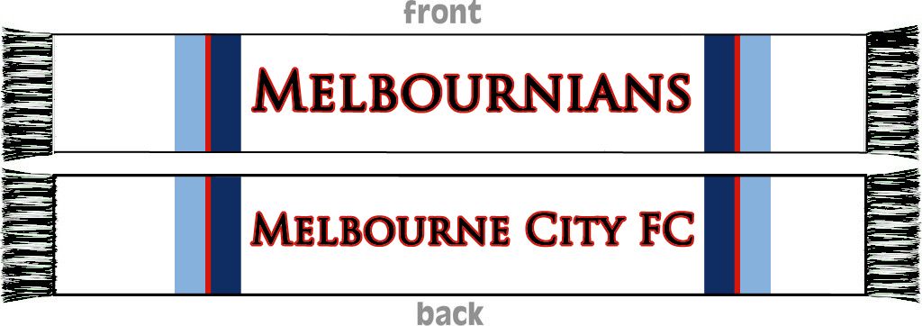
Was talking to the girl who was at the Melbourne City stand at the Italian festival in Carlton today and I asked if she knew when the away shirts would be available. She said December, probably earlier rather than later and almost definitely before the derby (20th).
Obviously no guarantees but she seemed to know what she was talking about.
-
Not a fan of burn city, but nothing wrong with putting out suggestions for people to consider.
I quite like the idea of having one side blank.
We could also have Melburnians on both sides. You'll only be looking at one side at a time anyway.
-
David Willa and David Villa.
Hopefully Williams can pick up a few things from David Villa and improve his finishing.
Could've had 20 goals last season with the chances he had. Still love him though.-
 2
2
-
-
- Popular Post
- Popular Post

-
18
-
Away shirt looks great. Will definitely be getting it.
Home shirt isn't bad, looks quite smart but is nothing special IMO.
-
I'm not sure that sky blue and navy blue stripe will be on our next home kit, that's my only concern.
Yeah I get what you're saying but those colours will almost definitely still be there in some form, so it will still be relevant.
If the kit does change from having the stripe, that shirt will still have been the first shirt of the Melbourne City era and the shirt at the time of the founding of the new supporters group.
-
1
-
-
 A variation with some more blue. The other one is probably still better though.
-
2
-
-
There's no "o". It's Melburnians.
-
2
-
-
- Popular Post
- Popular Post

-
13
-
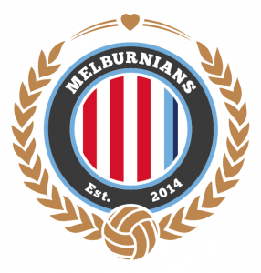
 The Heart of the City
 -
Thanks to everyone who's getting behind the latest version. Much appreciated.
I actually tried out the other heart (from the MHFC logo) when I was designing it and the shape didn't fit the space as well as the one shown.
Some people want one, some the other, but purely from an aesthetic point of view, this one is better.
-
 Another version with 2009 instead of Est. 2014.
-
2
-
-
- Popular Post
- Popular Post

-
18
-
 Some variations on the original (top left).
 -
This logo
Gold lettering on blue looks horrible. Also, as I said previously, it was agreed at the meeting that the colours should still be mainly red and white.
I think it's important to keep that in mind.
Besides, our home kit is mainly white with a little bit of blue and our away is red and white. Sky blue is definitely not our main colour.
 is getting alot of likes at the moment as it encompasses the red and white with the new sky blue. I think we're onto a winner!
Too much blue. How about this:

-
Gold lettering on blue looks horrible. Also, as I said previously, it was agreed at the meeting that the colours should still be mainly red and white.
I think it's important to keep that in mind.
Besides, our home kit is mainly white with a little bit of blue and our away is red and white. Sky blue is definitely not our main colour.
-

Im s*it with photoshop,but how about something like this? maybe with a blue outline instead of red also?
Something like this?

-
2
-
-
agreed. When you convert it to black on white and white on black it actually looks stylish. I think it's the bright colours that freaks people.
I feel sorry for the guy that designed the logo- I know you're on here. It's actually a good logo just a bit too bright and happy for an active support gang perhaps.
I think its also the shape of the love heart as such.. The original Melbourne heart logo steered clear from such a bubbly round heart I think if we want to incorporate the heart we should do the same! I also think if we want to involve the heart as well as the red and white stripes we should do one or the other.. Having the heart obviously shows the Melbourne heart heritage I think making the red so predominant in the logo is a bit of an overkill
At the terrace meeting that was held, the consensus view was that the terrace should remain predominantly red and white, but not exclude the sky blue completely. If the outcome of the discussion on colours at that meeting had been different then the colours in the logo/badge would obviously reflect that.
Regarding the shape of the heart, during the process and discussion surrounding the design, this shape heart was chosen because it was different to the MHFC logo and the heart shapes on the Melbourne City logo. The importance of emphasising our independence from the club by not using the same shape heart was brought up. Again, this was the view of the majority of people involved.
-
If anyone has the time to can they poet up our membership total compared to the other aleague clubs?
I don't think any other clubs have a counter. Some still don't even seem to have started selling memberships yet.
-
I find it strange that people would mention Victory also technically being 'Melburnians' when we've been singing "We are Melbourne..." and "Melbourne's red and white" as well as displaying the flag of Melbourne for years.
The way I see it it's just a continuation of that and a way of claiming the term.
We are Melbourne City and someone from Melbourne City is a Melburnian. It makes sense and will definitely grow on people.
-
2
-
-
What's with the year? Does it have any significance at all?
I am pretty sure Melbourne was founded in 1835 and I think that's what the purpose of the 47 is. Let's just hope I'm wrong because it might look a tad silly if they areMelbourne was granted city status in 1847.
-
1
-
-
"Our colour scheme will largely remain red and white, but as you can see by our logo we will not shy away from incorporating hints of sky blue. We are supporting Melbourne City FC and will therefore support ALL the colours of our club."
If we are supporting the colours of the club, shouldn't it be majority blue with a hint of red? Bit of a contradiction don't you think?
There's not much blue in our kits to be fair. At least for the moment.
-
The roman numerals on the facebook page technically arnt correct?
2014 = MMXIV
Pretty sure they're right.
Robert Koren (confirmed by club as released)
in Melbourne City
Posted
If I had to choose I would definitely rather JVS leave. I actually wouldn't be surprised if a few players (including Koren) improved under a different manager.
Would still rather we replaced Koren as international marquee though. We can do better.