Bannon Posted June 16, 2014 Report Share Posted June 16, 2014 ^this its a totally new club, there playing HOME games in white and blue given that ill still be attending. Quote Link to comment Share on other sites More sharing options...
drewmelbcity Posted June 16, 2014 Report Share Posted June 16, 2014 Melbourne Heart is dead. Only have to look at how Melbourne City keeps referring to "the club that would become Melbourne City" since the rebrand to see that they don't see it as one continuous club. Don't try and kid yourself otherwise. The fans decide whether Melbourne Heart is dead or not, i'll purchase the new home top, wear it to the games and i'll also be bringing my old school Melbourne Heart scarf along to wear with it. At the end of the day i'll pay homage to my past and respect our new image at the same time. No one is stopping supporters wearing the red and white jerseys to the game and I doubt the city group will try to do so (considering the away top is red n white) at the end of the day I want to see my club succeed and pull in the crowds and I hope that all old supporters get behind it whether your in white and sky blue or the red and white. Quote Link to comment Share on other sites More sharing options...
Ando Posted June 16, 2014 Report Share Posted June 16, 2014 Melbourne Heart as we knew is gone, but does that make it an entirely new club? 1 Quote Link to comment Share on other sites More sharing options...
Jimmy Posted June 16, 2014 Report Share Posted June 16, 2014 Melbourne Heart as we knew is gone, but does that make it an entirely new club? This. It's not a completely new club by any stretch. Quote Link to comment Share on other sites More sharing options...
drewmelbcity Posted June 16, 2014 Report Share Posted June 16, 2014 Unless they get all new supporters Quote Link to comment Share on other sites More sharing options...
Jestr Posted June 16, 2014 Report Share Posted June 16, 2014 Melbourne Heart as we knew is gone, but does that make it an entirely new club? No it doesn't Quote Link to comment Share on other sites More sharing options...
FB. Posted June 16, 2014 Report Share Posted June 16, 2014 Melbourne Heart is dead. Only have to look at how Melbourne City keeps referring to "the club that would become Melbourne City" since the rebrand to see that they don't see it as one continuous club. Don't try and kid yourself otherwise. The fans decide whether Melbourne Heart is dead or not, i'll purchase the new home top, wear it to the games and i'll also be bringing my old school Melbourne Heart scarf along to wear with it. At the end of the day i'll pay homage to my past and respect our new image at the same time. No one is stopping supporters wearing the red and white jerseys to the game and I doubt the city group will try to do so (considering the away top is red n white) at the end of the day I want to see my club succeed and pull in the crowds and I hope that all old supporters get behind it whether your in white and sky blue or the red and white. I'm just being realistic. You're fighting an uphill battle as supporters saying it's the same club, when in everything the club has released so far is effectively saying that they're a new club. Just look at the diagram posted on the previous page. Don't get me wrong, I'm not happy with that view and it pisses me off, but the club itself doesn't see it the way you do. Quote Link to comment Share on other sites More sharing options...
InMyHeart Posted June 16, 2014 Author Report Share Posted June 16, 2014 I think most were nervous when City bought us and the fact that what we were may change dramatically..... All in all the changes haven't been all that bad, the name is a tick so too the badge, the colours of the kit has worked out alright. and thus people who may have thought there would be a, sky blue everywhere b, no red and white Were completely against this a couple of months ago... this didn't happen and hence the continued participation with the club 1 Quote Link to comment Share on other sites More sharing options...
Tesla Posted June 16, 2014 Report Share Posted June 16, 2014 This topic is for discussing the logo, no more personal fights. 2 Quote Link to comment Share on other sites More sharing options...
Blackout Posted June 16, 2014 Report Share Posted June 16, 2014 (edited) I like the new logo, the dominant colour is clearly red - hopefully this will see some red make its way into the home kit in time. Admittedly it is a little too similar to NYC's crest, but the logo itself I'm a fan of. Edited June 16, 2014 by Blackout Quote Link to comment Share on other sites More sharing options...
Popular Post Jimmy Posted June 16, 2014 Popular Post Report Share Posted June 16, 2014 I love yarraside politics 7 Quote Link to comment Share on other sites More sharing options...
billyheart Posted June 16, 2014 Report Share Posted June 16, 2014 Like the idea of the logo, the yellow/gold though hasn't grown on me like the rest has. I think 5 colours with the light on a white makes it too busy, would live to see more mock ups with just the two blues, white and red. Or maybe a darker "charcoal" in place the the yellow. I can see its class, I like the connection with NYCFC and the two little hearts on it. Quote Link to comment Share on other sites More sharing options...
Dylan Posted June 16, 2014 Report Share Posted June 16, 2014 You know your club has a great badge when at first you don't like it and then it grows on you. I think it's best quality is that it just feels authentic, like it was hand drawn that there was labour involved and not just mocked up in illustrator in 5 mins. Excuse the wanky words Quote Link to comment Share on other sites More sharing options...
kingofhearts Posted June 16, 2014 Report Share Posted June 16, 2014 I love yarraside politics Quote Link to comment Share on other sites More sharing options...
Jimmy Posted June 16, 2014 Report Share Posted June 16, 2014 I love yarraside politics A lot more happens in the public sections of this forum than I would of expected, I imagine the private sections would resemble a girls room on year 8 camp when someone kisses their best friend's boyfriend. 4 Quote Link to comment Share on other sites More sharing options...
Red or Dead Posted June 16, 2014 Report Share Posted June 16, 2014 I love yarraside politics I love it almost as much as Cityside politics! Quote Link to comment Share on other sites More sharing options...
sheepdog Posted June 16, 2014 Report Share Posted June 16, 2014 This topic is for discussing the logo, no more personal fights. You wanna fight cunt? Quote Link to comment Share on other sites More sharing options...
Jimmy Posted June 16, 2014 Report Share Posted June 16, 2014 (edited) This topic is for discussing the logo, no more personal fights.You wanna fight cunt?You'll lose any fight you have with Tesla. Whether it be a physical confrontation, a game of chess, a spelling bee or anything else you could come up with. Edited June 16, 2014 by Jimmy 1 Quote Link to comment Share on other sites More sharing options...
morphine Posted June 16, 2014 Report Share Posted June 16, 2014 I love it almost as much as Cityside politics! What's Cityside? Quote Link to comment Share on other sites More sharing options...
kingofhearts Posted June 16, 2014 Report Share Posted June 16, 2014 This topic is for discussing the logo, no more personal fights. You wanna fight cunt? You'll lose any fight you have with Tesla. Whether it be a physical confrontation, a game of chess, a spelling bee or anything else you could come up with. Maybe we've just found our undercard for round 1 for the main fight between yourself and MELBHRT/MANU/ext Quote Link to comment Share on other sites More sharing options...
Popular Post Jimmy Posted June 16, 2014 Popular Post Report Share Posted June 16, 2014 (edited) Tesla is going to have to fight in two bouts with his Tesla and Cadete vs. FB and Ando tag team match also scheduled for Round 1. Edited June 16, 2014 by Jimmy 8 Quote Link to comment Share on other sites More sharing options...
Alexxandro Posted June 16, 2014 Report Share Posted June 16, 2014 This topic is for discussing the logo, no more personal fights. You wanna fight cunt? You'll lose any fight you have with Tesla. Whether it be a physical confrontation, a game of chess, a spelling bee or anything else you could come up with. I'll take the Chess challenge... Quote Link to comment Share on other sites More sharing options...
Jovan Posted June 16, 2014 Report Share Posted June 16, 2014 This topic is for discussing the logo, no more personal fights. You wanna fight cunt? You'll lose any fight you have with Tesla. Whether it be a physical confrontation, a game of chess, a spelling bee or anything else you could come up with. I'll take the Chess challenge... Lets hope for all our sake, there is some sort of announcements soon, this could get messy. Quote Link to comment Share on other sites More sharing options...
kingofhearts Posted June 16, 2014 Report Share Posted June 16, 2014 Tesla is going to have to fight in two bouts with his Tesla and Cadete vs. FB and Ando tag team matched also scheduled for Round 1. on fire tonight mate haha Quote Link to comment Share on other sites More sharing options...
Red or Dead Posted June 16, 2014 Report Share Posted June 16, 2014 I love it almost as much as Cityside politics! What's Cityside? It's the new supporters group on the city side of AAMI Park...just kidding, doesnt exist...but it should...and if it did, it'd have politics too! Quote Link to comment Share on other sites More sharing options...
Jimmy Posted June 16, 2014 Report Share Posted June 16, 2014 (edited) Cityside will never take over my CEDC's turf. Edited June 16, 2014 by Jimmy 3 Quote Link to comment Share on other sites More sharing options...
JD. Posted June 16, 2014 Report Share Posted June 16, 2014 Reminds me of Wigan Athletic's but still good as, differs from all the other dodgy looking one used in the a league. Quote Link to comment Share on other sites More sharing options...
M13 Posted June 16, 2014 Report Share Posted June 16, 2014 My father lives in an old cottage that everyone there knows as "the river cottage" ... At times in its history it have changed shape, rooms have been added, stables have been removed, it have been repainted and almost burned down once. But it´s still the same old "River Cottage".. ain´t it? 1 Quote Link to comment Share on other sites More sharing options...
Moraiwe Posted June 16, 2014 Report Share Posted June 16, 2014 (edited) Depends upon whether you define its identity as being simply the building itself, or the atmosphere it creates. A building can be renovated and end up with a completely different feel. As such it's easy to see it as being a new place. Edited June 16, 2014 by Moraiwe Quote Link to comment Share on other sites More sharing options...
Jun Posted June 16, 2014 Report Share Posted June 16, 2014 Ship of Theseus etc. etc. Better minds than ours have been pondering this for hundreds of years. Its how it feels to you that matters. 1 Quote Link to comment Share on other sites More sharing options...
perthheart Posted June 16, 2014 Report Share Posted June 16, 2014 My father lives in an old cottage that everyone there knows as "the river cottage" ... At times in its history it have changed shape, rooms have been added, stables have been removed, it have been repainted and almost burned down once. But it´s still the same old "River Cottage".. ain´t it? Dad? 2 Quote Link to comment Share on other sites More sharing options...
M13 Posted June 16, 2014 Report Share Posted June 16, 2014 LOL.. No, it´s near Stalybridge if you look for my dad Quote Link to comment Share on other sites More sharing options...
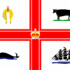
Red or Dead Posted June 17, 2014 Report Share Posted June 17, 2014 I definitely like it, but it does seem strange to have 'MCFC' as well as 'Melbourne City Football Club' on it. The hearts are a great touch, and I love the font used (Gotham). I also think it's great that the Melbourne flag was incorporated into it, and I'd like to think this is a nod to the fans using the flag for the last few years. The 4 redrawn icons work well, and it's clever and quite subtle to use the ship from the Man City crest (even though I'm not a Man City fan. The opposite in fact). I wouldn't have put the crown on it, even though I know it's on the Melbourne flag, but that's more to do with my personal opinion of the monarchy than anything else. Overall it does have a great 'traditional' football crest feel to it. I'm a fan, whenever we had threads before the takeover about changing the badge I liked the ones people designed that included our flag in them. It gave them more of a traditional feel.Wouldn't mind an est 2008 on it though. I think it'd look great if they removed the MC {crown} FC and replaced it with 20 {crown} 08. It's a shame our first ever game was on 05/08. If it was on 20/08 the 20 08 would've had a double meaning! ;-) To be realistic though; I have a suspicion that the MC FC on the red cross might be a reference to our parent club and not Melbourne City...hence the need to have Melbourne City Football Club and MC FC Quote Link to comment Share on other sites More sharing options...
Jun Posted June 17, 2014 Report Share Posted June 17, 2014 I definitely like it, but it does seem strange to have 'MCFC' as well as 'Melbourne City Football Club' on it. The hearts are a great touch, and I love the font used (Gotham). I also think it's great that the Melbourne flag was incorporated into it, and I'd like to think this is a nod to the fans using the flag for the last few years. The 4 redrawn icons work well, and it's clever and quite subtle to use the ship from the Man City crest (even though I'm not a Man City fan. The opposite in fact). I wouldn't have put the crown on it, even though I know it's on the Melbourne flag, but that's more to do with my personal opinion of the monarchy than anything else. Overall it does have a great 'traditional' football crest feel to it. I'm a fan, whenever we had threads before the takeover about changing the badge I liked the ones people designed that included our flag in them. It gave them more of a traditional feel.Wouldn't mind an est 2008 on it though. I think it'd look great if they removed the MC {crown} FC and replaced it with 20 {crown} 08. It's a shame our first ever game was on 05/08. If it was on 20/08 the 20 08 would've had a double meaning! ;-) To be realistic though; I have a suspicion that the MC FC on the red cross might be a reference to our parent club and not Melbourne City...hence the need to have Melbourne City Football Club and MC FC I wouldn't look into it too much, superfluous yes, but NYCFC also have New York City Football Club and NYC on the logo Quote Link to comment Share on other sites More sharing options...
jw1739 Posted June 17, 2014 Report Share Posted June 17, 2014 I suspect that could be deliberate. Means that in certain circumstances, just the internal circle can be used. For example, as a label or whatever. Once the whole trademark is registered then I would say the distinctive elements of it are also protected. For example, even if we use the inside circle of our badge, there can be no confusion with the City of Melbourne because of the MCFC. Just guessing of course! Quote Link to comment Share on other sites More sharing options...
Tbitm Posted June 17, 2014 Report Share Posted June 17, 2014 I think I know where city got their idea for nycfc's and our badges... Quote Link to comment Share on other sites More sharing options...
Robinho Posted June 17, 2014 Report Share Posted June 17, 2014 A Man City fan mate in Sydney asked me what the symbols on the centre of the new badge represent. I told him... The whale represents the huge lies told by CFG re. 'kept the white' from the old colours, when they really wanted sky blue but the FFA and Sydney would not sanction it. The bull represents all the bullshit CFG spouted re. listening to the fans. The sheep represents all of the citeh fans that have jumped the bandwagon. The ship represents the loyal foundation members sailing away into the sunset. 2 Quote Link to comment Share on other sites More sharing options...
Robinho Posted June 17, 2014 Report Share Posted June 17, 2014 He told me I'm just a bitter red. Quote Link to comment Share on other sites More sharing options...
Dylan Posted June 17, 2014 Report Share Posted June 17, 2014 And so he should have. The previous colours were red AND white Quote Link to comment Share on other sites More sharing options...
Robinho Posted June 17, 2014 Report Share Posted June 17, 2014 (edited) He reckons they'll get rid of all the red next year. We'll settle our differences at the Sydney away game where I'll be wearing red and white and he'll be wearing white and blue! Edited June 17, 2014 by Robinho Quote Link to comment Share on other sites More sharing options...

Recommended Posts
Join the conversation
You can post now and register later. If you have an account, sign in now to post with your account.